G/BA’s Trend Sumoâ„ software makes comprehensive analysis of air-handling unit trends faster, better, and cheaper than before.
Are the air-handling units in your building operating at the lowest possible cost? How can you be sure your AHUs are performing effectively without the data to prove it?
To optimize AHU control, many patterns must be examined. Some energy-wasting error conditions only happen during specific outside-air conditions. Some only occur in the middle of the night, or a few times a year when a specific pattern of events unfolds.
By analyzing trend data, engineers can better understand AHU performance across a multitude of real-world conditions over the course of weeks or months. But finding potentially significant patterns can be time-consuming, requiring examination of hundreds of thousands of data points.
Enter Trend Sumoâ„ , G/BA’s new in-house analytics software. Written using the Python programming language, Trend Sumo helps automate AHU trend data analysis, so our team can dig deeper and find more savings for clients. The software leverages trending exports from existing building automation systems, without requiring clients to implement a new software application. The analysis timeline is flexible, and no long-term contracts are required.
In a recent retro-commissioning project at a Chicago-area hospital, G/BA engineers found just over 1.7 million kWh of electricity savings—202,000 kWh of which would have been impossible to find without analytics software. This represents nearly $14,000 of additional savings per year.
However, data alone can’t yield maximum savings. Rather, the best results come from a synthesis of engineering experience and automated data analysis: a combination that provides better value than either resource could produce on its own.
How does it work?
Trend Sumo helps us view the data from four different perspectives: time series, fault algorithm, weekday bin data, and data vs. outside air temperature. For each perspective, the software generates key graphical comparisons that quickly highlight the most important information.
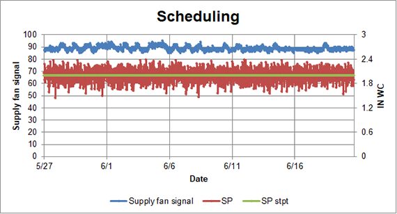
A time series perspective focuses on AHU operation over time: the typical approach to trend data analysis. It allows engineers to analyze and present the data in a standard way, with time on the X-axis of the graph.
For example, the graph below shows the potential for scheduling the unit, as implied by variations in the supply fan signal (blue). The graph also illustrates that this AHU is having some issues controlling static pressure (red), which is displaying a higher than optimal variation from the setpoint (green).
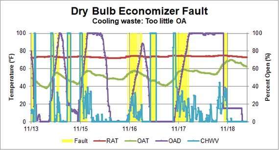
A fault algorithm perspective highlights when certain conditions indicative of poor operation are true. Each algorithm is created to call attention to the exact conditions when operation is not optimal.
For instance, consider a scenario combining the following conditions (illustrated in the graph below):
- The unit has a dry bulb economizer setpoint.
- The outside air damper (purple) is less than 100% open.
- The outside air temperature (green) is less than the return air temperature (red).
- The chilled water valve (blue) is open.
- The unit is on.
In this case, the unit is using mechanical cooling instead of bringing in more outside air to condition the space. This is a classic example of an opportunity to optimize the economizer sequence of operations. This results in energy waste and higher utility bills.
In the graph, periods when the AHU is in fault condition are highlighted in yellow. This view gives engineers and their clients a graphic representation of the unit’s performance, with added emphasis on the incorrect baseline operation. The fault view encourages engineers to dig deeper to determine the root cause for the incorrect operation.
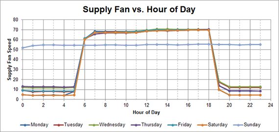
Trend Sumo uses the perspective of weekday bin data to determine typical building load, unit operation, and other patterns based on a typical week or day. For example, the graph below is from an AHU serving a computer science lab. It shows that the unit is typically scheduled to be off between 7 p.m. and 5 a.m., but for some reason the unit is not setting back on Sunday (light blue). Again, the graphic output signals the engineers to investigate.
The perspective of data vs. outside air temperature allows engineers to see how data points vary with changes in weather. In the graph below, depicting an AHU that serves a university dining hall, we discovered that the outside air damper (orange) is open at high outside air temperatures and bringing in too much outsideair. This is preventing the discharge air temperature of the unit (red) from meeting the setpoint (light blue), with the chilled water valve (dark blue) at 100% above outside air temperatures of about 78°F. Energy is being wasted, and occupant comfort is compromised.

The in-depth analysis provided by Trend Sumo, coupled with our team’s extensive design, commissioning, and retro-commissioning experience, helps G/BA diagnose AHU problems and provide appropriate recommendations. G/BA has found that through the synthesis of our engineering experience and automated data analysis we have been able to identify and implement energy savings improvements faster — boosting operating efficiency and reducing headaches for the operations and maintenance staff.
To learn more, or to discuss opportunities for a trend-based review on your building, reach out! We’d be happy to help.